
CapCut Design System: Functional Minimalism with Cinematic Edge
Explore CapCut's design system - dark palette, bold typography, 8px grid. Learn to build creator-focused UIs with cinematic minimalism.
capcut.com
Discover brand design systems and get ready-to-use prompts for AI coding assistants.
Explore CapCut's design system - dark palette, bold typography, 8px grid. Learn to build creator-focused UIs with cinematic minimalism.
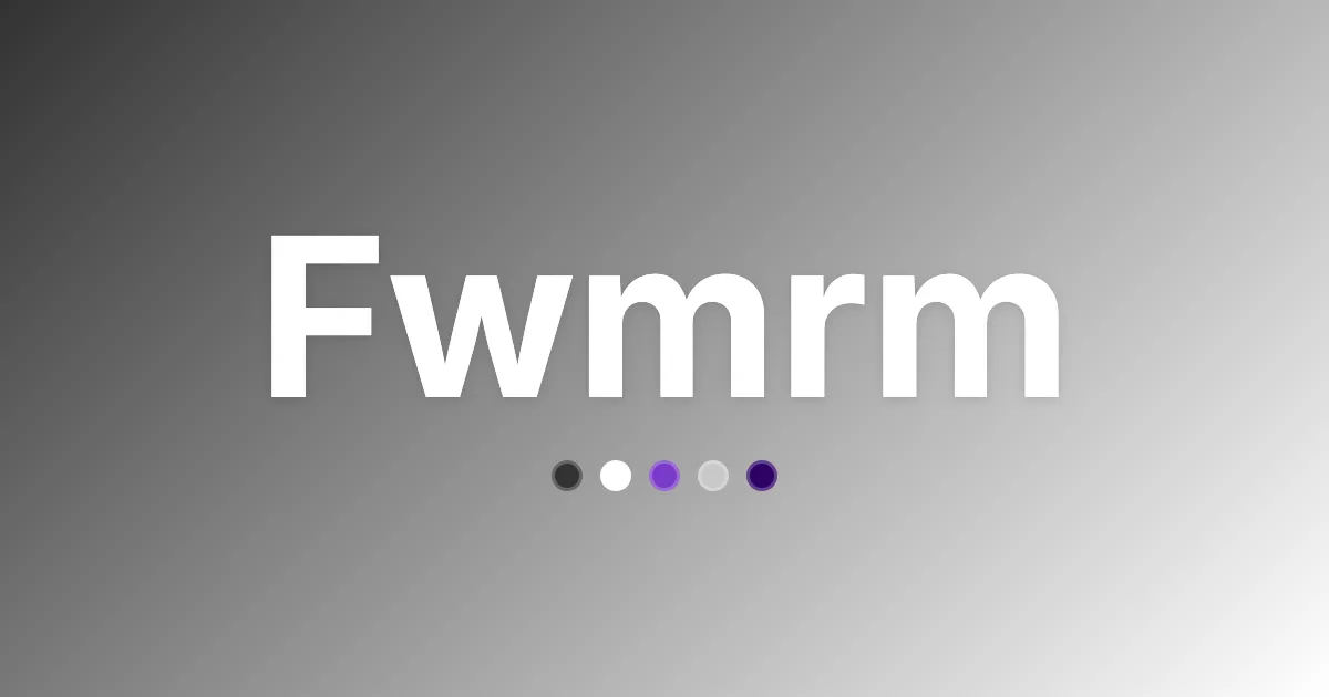
Explore Fwmrm's design system - corporate-functional colors, typography, and grid precision. Build enterprise UIs with bold violet accents.

Explore JD's design system - retail-first colors, typography, and spacing rules. Build high-density, functional e-commerce UIs with JD's style.
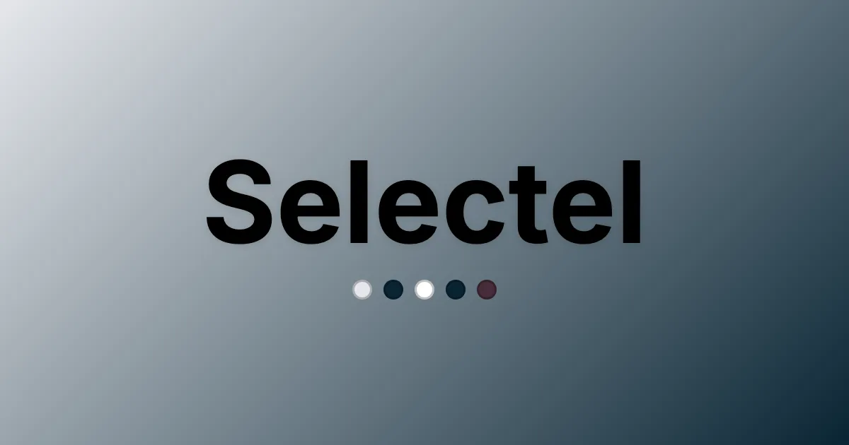
Explore Selectel's design system - enterprise-grade colors, typography, and UI components. Build precise, scalable interfaces with trusted brand style.

Explore Btloader's design system - minimal colors, system fonts, 8px grid. Learn how Btloader's stripped UI serves developer speed.

Explore Instructure's design system - colors, typography, and spacing. Learn how Instructure blends academic trust with tech approachability.
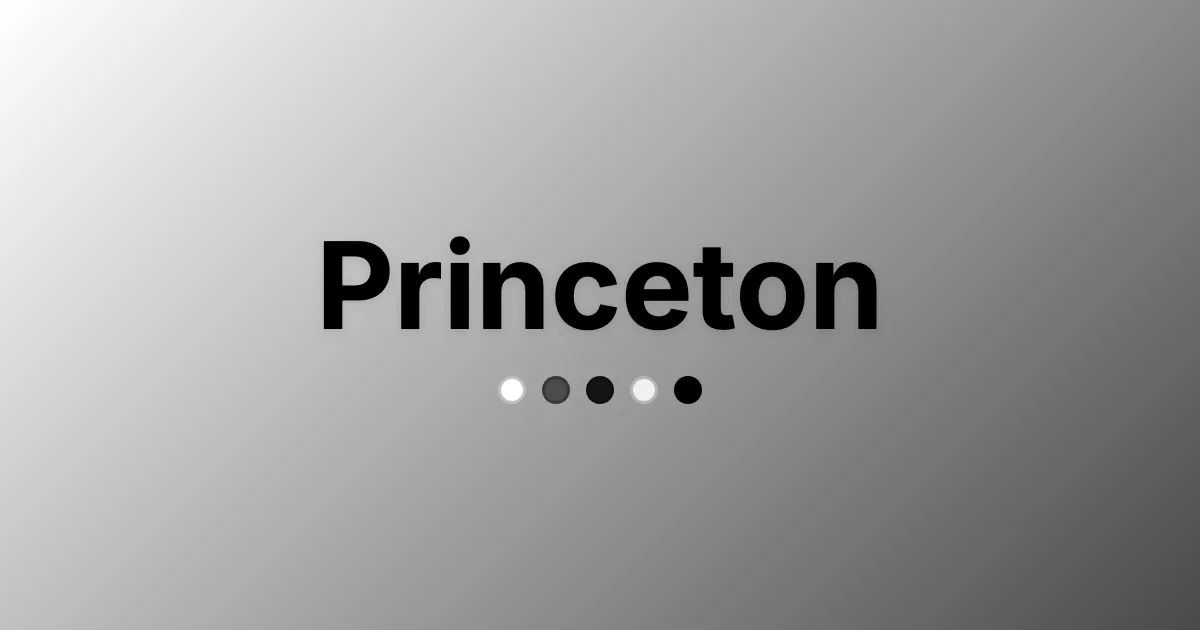
Explore Princeton's design system - disciplined colors, sharp typography, and precise grid. Learn to craft prestigious academic interfaces.

Explore Adblock Plus' design system - minimal colors, precise typography, and functional UI components. Build clear, trust-focused interfaces.
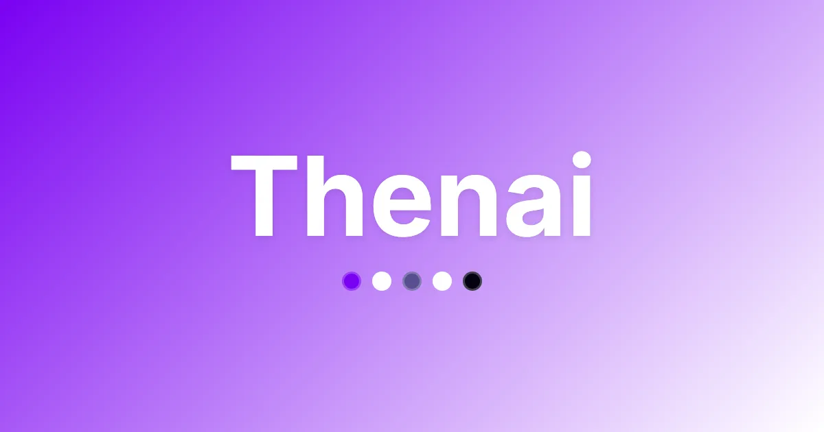
Explore Thenai's design system - academic minimalism, violet accents, typography, and grid. Learn how to build with its strict visual identity.

Explore USPS's design system - institutional colors, typography, and components. Build interfaces that match USPS's trusted visual identity.
Explore Figma's design system - neutral colors, custom typography, disciplined 8px grid. Build precise, content-first interfaces with Figma's visual language.
Explore ISO's design system - authoritative colors, typography, and grid specs. Build consistent, standards-driven interfaces with ISO's visual language.