Archive Design System: Utilitarian Web Preservation UI
Explore Archive's design system - minimal colors, native typography, and utilitarian UI built for web preservation and universal access.
archive.org
Discover brand design systems and get ready-to-use prompts for AI coding assistants.
Explore Archive's design system - minimal colors, native typography, and utilitarian UI built for web preservation and universal access.
Explore DreamHost's design system - colors, typography, spacing, and components. Build approachable, tech-forward UIs with their visual language.
Explore Ring's design system - colors, typography, and UI specs. Build secure, trustworthy interfaces with Ring's visual language.

Explore Google's design system - colors, typography, spacing principles. Learn how Google creates a minimal, accessible, global UI.
Explore Buzzfeed's design system - bold colors, playful typography, dense layouts. Learn how Buzzfeed drives clicks with mobile-first UI.
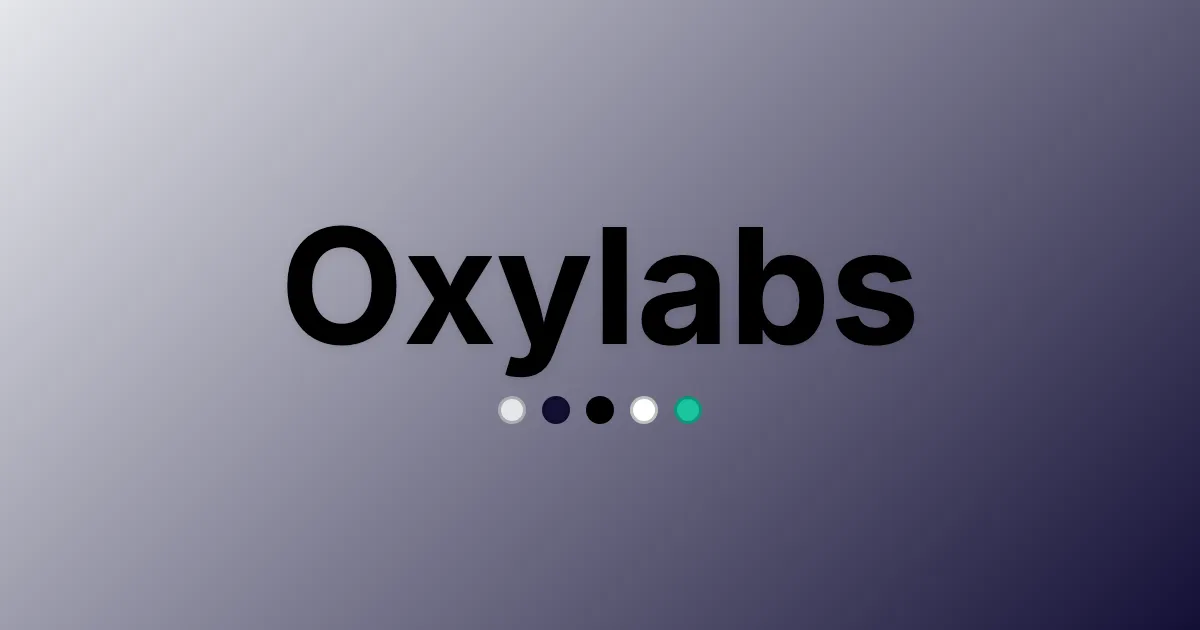
Explore Oxylabs' design system - bold colors, modern typography, precise grid specs. Build scalable, developer-friendly UIs with Oxylabs' visual language.
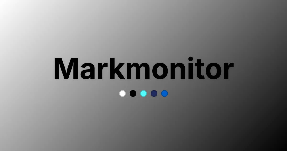
Explore Markmonitor's design system - colors, typography, and layout rules. Build precise, trust-focused UIs for brand protection.
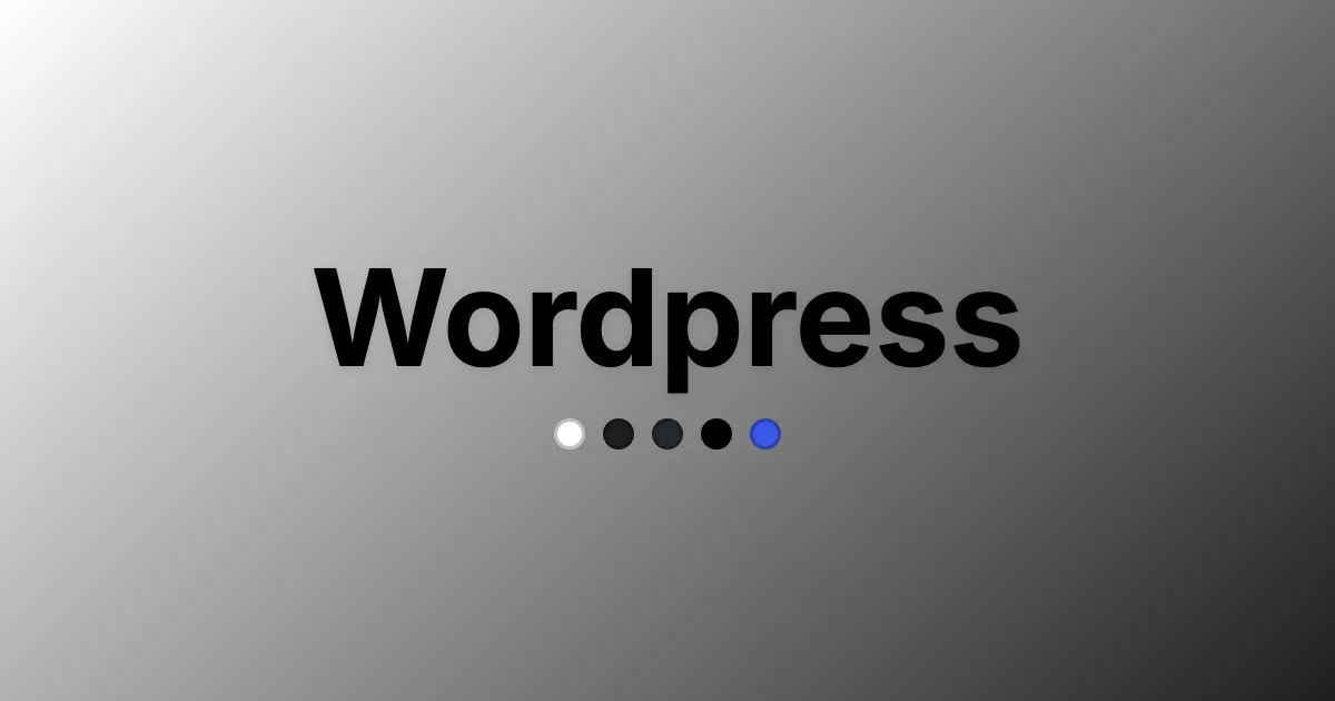
Explore WordPress's design system - colors, typography, spacing, and components. Build clear, content-focused sites with WordPress's visual language.
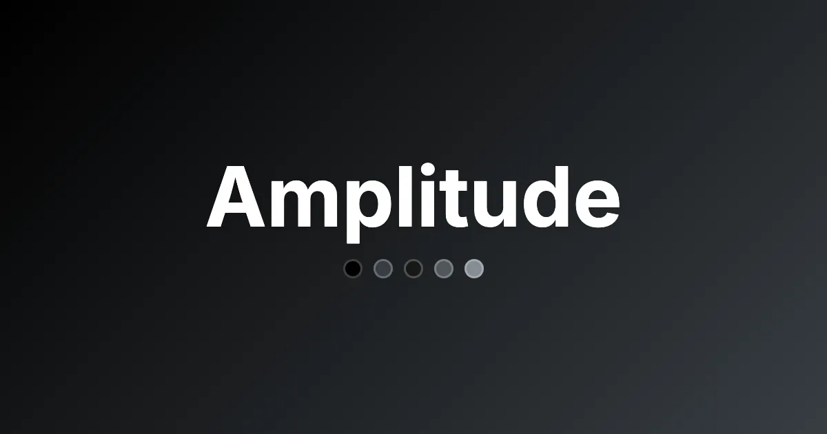
Explore Amplitude's design system - colors, typography, spacing, and components. Build clean, data-focused UIs with their visual language.
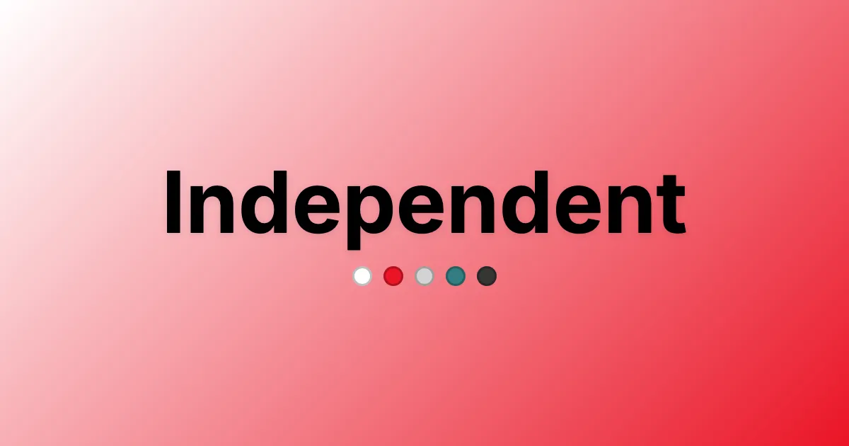
Explore Independent's design system - restrained colors, bold typography, precise grid. Build trusted news UIs with their visual language.
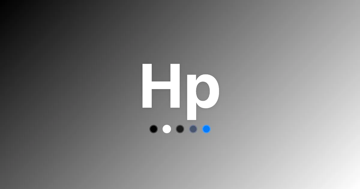
Explore HP's design system - corporate blues, typography, and 8px grid. Build consistent, accessible tech UIs with HP's visual language.
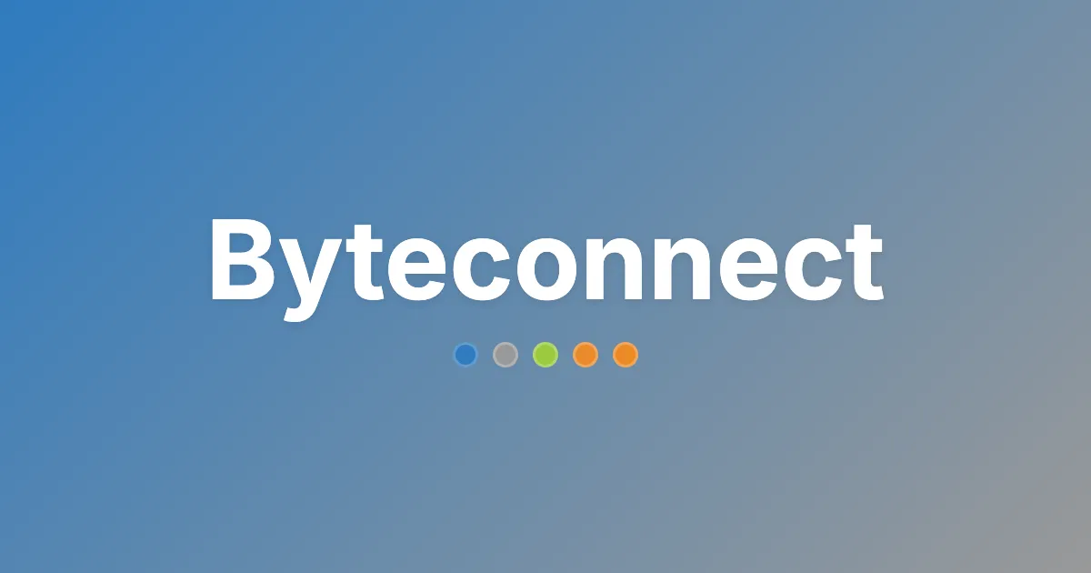
Explore Byteconnect's design system - minimalist colors, system fonts, grid spacing. Build fast, clear UIs with Byteconnect's visual language.