Appspot Design System: Minimal Enterprise UI Clarity
Explore Appspot's design system - Material 3 colors, typography, and UI specs. Build secure, predictable enterprise apps with Google cloud style.
appspot.com
Discover brand design systems and get ready-to-use prompts for AI coding assistants.
Explore Appspot's design system - Material 3 colors, typography, and UI specs. Build secure, predictable enterprise apps with Google cloud style.
Explore Pages' design system - colors, typography, and spacing. Build fast, secure static sites with a minimalist developer-first UI.
Explore Daily Mail's design system - colors, typography, tight grid. Learn how its dense tabloid style drives reader engagement.
Explore Medium's design system - monochrome palette, oversized typography, pill-shaped buttons. Learn how Medium crafts a timeless reading experience.
Explore Mozilla's design system - high-contrast colors, bold typography, 8px grid. Build transparent, trust-focused web experiences.
Explore Ngenix's design system - colors, typography, and grid specs. Build enterprise-ready UIs with Ngenix's precise, minimal visual language.
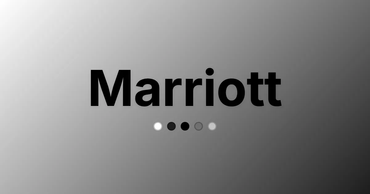
Explore Marriott's design system - neutral colors, Swiss-721 typography, and pill-shaped buttons. Learn how Marriott crafts a premium digital experience.
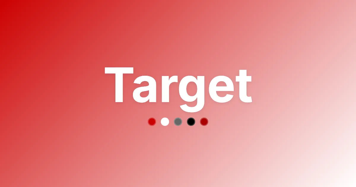
Explore Target's design system - bold red branding, Helvetica typography, and grid-based spacing. Build retail UIs with Target's visual language.
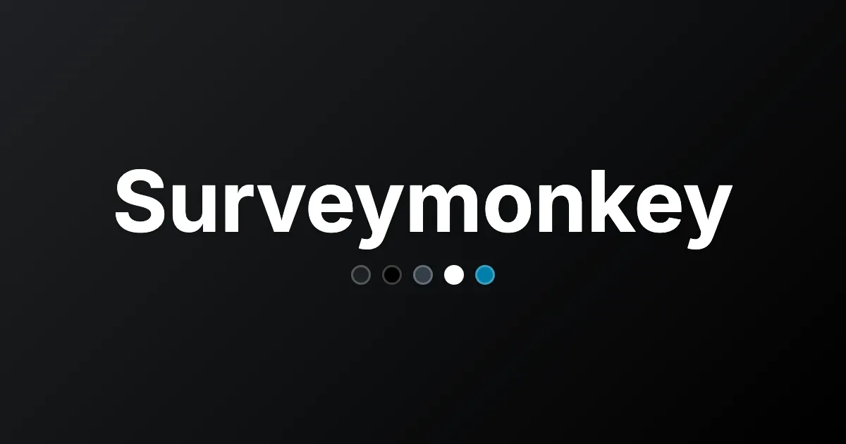
Explore Surveymonkey's design system - vibrant greens, typography, and 8px grid. Learn how it balances trust, accessibility, and brand distinction.
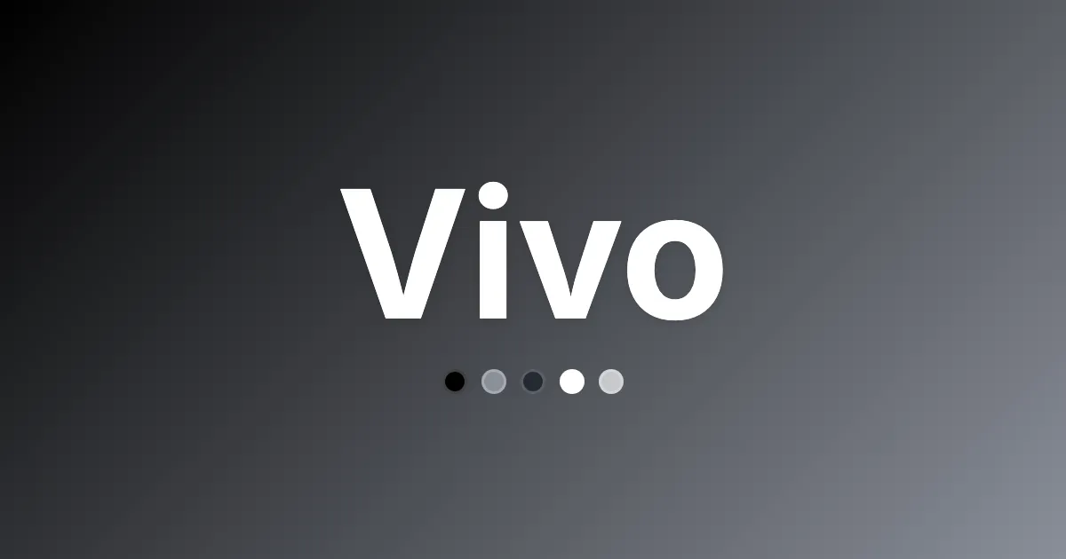
Explore Vivo's design system - precise colors, custom typography, and minimal UI components. Build premium tech interfaces with Vivo's visual language.
Explore Indexww's design system - serif typography, 8px grid, and minimal UI. Learn how Indexww builds trust through disciplined design.
Explore Googleapis' design system - minimal colors, Arial typography, functional layout. Build clear, fast developer UIs with Google APIs.